4 Techniques to Effectively Use Asymmetry in Web Design


Every website begins with a blank white page like a canvas waiting to be painted. The page will be filled with different elements like a logo, texts, photographs, illustrations, etc. The arrangement of elements can determine how successful the design will be. That’s why it is crucial to decide what the arrangement will be on the page.
Connect with Yes Web Design Studio at https://yeswebdesignstudio.com
Two basic approaches are identified in this arrangement — symmetry, and asymmetry. Symmetry is stable and balanced. In contrast, asymmetrical design techniques seem tricky for web design, but it can create distinct focal points. To create a perfect asymmetry web design, please follow the instructions below!
WHEN TO USE ASYMMETRY?
- Ready to spend extra time arranging elements
- Attempt to uniquely achieve balance in the design
- Seek for a more playful layout
WHAT CAN ASYMMETRY DESIGN DO?
- ASYMMETRY MAKE THE LAYOUT STAND OUT
The site needs to stand out from other competitors. By using an asymmetrical design to create a website, you can achieve a memorable experience and create more memorable products for visitors.
- ASYMMETRY CONVEY DYNAMISM
Asymmetrical designs can evoke feelings of movement to viewers. There is no surprise that many sports brands use asymmetry in website elements such as the logo or illustrations.
- ASYMMETRY DRAW ATTENTION
Asymmetry grabs attention! A perfect asymmetrical layout will direct the viewer’s eye to the focal points. When positioning and adjusting elements on a page to choose focal points, remember that the main goal is communication so that it will help you tell the story in the most effective way.

ASYMMETRICAL DESIGN #1 : ASYMMETRICAL DESIGN USES
The asymmetrical design is beneficial for almost all of the design. This technique creates a great contrast and dimension to any designs. Be aware, you should carefully arrange elements in a way that matches the tone of the design as well.
Also, the asymmetrical design can create balance or motion. The key point is to create a nice structure so that the design is balanced. The common example is when photo placement often happens off-center creating an element of asymmetry.
Asymmetrical design techniques are often used in combination with symmetrical items so that it looks more well-balanced. Still not sure about how to use asymmetrical elements in your design? Ask a professional web designer to help you out!
ASYMMETRICAL DESIGN #2 : IMAGES AND TEXT
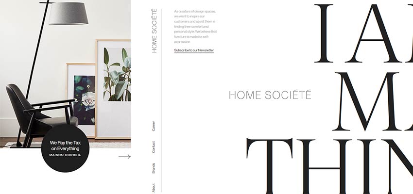
Just follow a common technique used by various designers when you have no idea how to create a sense of balance in asymmetry. Most designers often put different elements together like images and text. The most important part is how you combine the two together.
The mood of the image and text must be complementary. There is a possibility that you will use more than just a picture and a few words to create a perfect combination. By creating a contrasting design, then the perfect asymmetrical design could not be achieved.
One of the key elements in making this technique work is linking the text and image. Both words and images have to imply the same context. Plus, the design of these two elements has to be connected so that it compliments each other.
ASYMMETRICAL DESIGN #3 : IMAGES AND SPACE
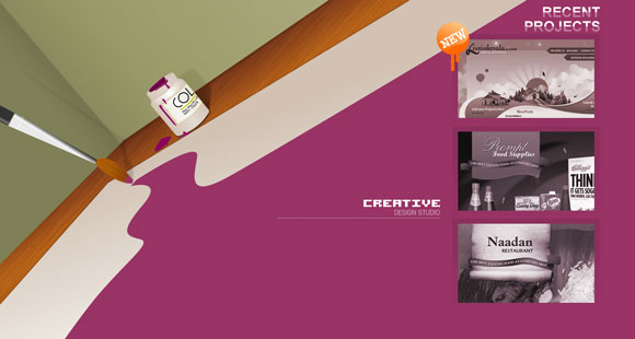
Symmetry and asymmetry can be achieved not only by using design elements, but a simple blank space can also create a perfect outcome. Often neglected, space can be used to create an asymmetrical effect.
Space is paired with a heavy element, like images or text, to create a sense of weight or motion in the design. For instance, when the image points to the direction in which there is nothing, it creates a feeling of motion that moves a user from the left to right on the page. Also, space creates a contrast with the fullness of the rest of the page by using its emptiness.
Another common way to create asymmetry is to cover portions of the viewable area by using sidebars and color blocking. Although the design has a distinct sense of symmetry, the overall look is asymmetrical when using this concept.
ASYMMETRICAL DESIGN #4 : COLOR
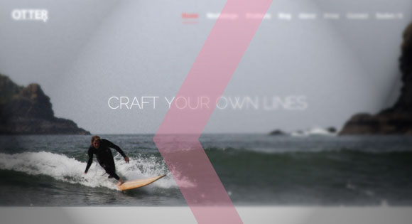
Similar to the use of space, the selection of colors can also create a sense of asymmetry. Sharp contrasting colors can create a feeling of off-balance and chaotic – white and black or colors of the opposite side of the color wheel.
The balance of asymmetrical design can be created by the use of asymmetrical color patterns. The classic combinations of color schemes usually create symmetry and harmony. By choosing something different and outside the norm, the design will be less formal and create beautiful asymmetrical elements.
Or you can experiment with backgrounds that contrast with the images or text on top. For example, asymmetry is created by pairing a pale, light yellow background with strong neon purple type. Another common technique is to create an item with lots of different colors and combine it to another item with little or no color to create a great contrast.

Symmetry and asymmetry design give different outcomes and effects for websites. Nevertheless, the asymmetrical design is tricky. It can improve your web design as well as ruin it. Uniqueness in design can be achieved by asymmetrical elements if you use it well. Remember this! A beautiful asymmetrical design is memorable to viewers which can lead to successful web design.
Yes Web Design Studio is Thailand’s leading web design company that believes in the impact of our work on our client’s success. Yes is an independent playground to showcase our unlimited creativity and imagination. With our passion and client-focus philosophy, Yes has created many outstanding and innovative websites for our clients since the start of our journey. At Yes! we strive to exceed client expectations and confidently lead the trend of web design. Our company receives constant trust in creating exciting projects from our clients across all industries internationally.


